Whether you are in the thick of redesigning your website or simply considering a new look sometime in the near future, it’s important to remember that there’s more to your website than the homepage. The blog post is many readers’ first impression of your site — not your homepage.
The homepage is many visitors’ first impression. It’s a place where readers navigate after visiting a blog post. It’s the page clients and brands might discover first.
And it’s the page of your site that should begin to tell the story of your brand and your blog, letting visitors unfold new chapters with clicks to your about page, recipe index and blog posts.
So it makes total sense why so much attention is paid to the homepage! It is super important.
But can we be honest? The homepage is not most people’s first impression of your site. It’s the blog post.
Why the blog post design matters
Look at your analytics: We’re willing to bet most people are finding your recipes on Google and Pinterest, so they’re landing on your blog posts before they ever see your homepage.
That’s why, throughout our web design process, our goal is to create a seamless experience for every user, a gorgeous brand that reflects your audience and goals on every single page, starting with the blog post.
READ MORE: Here are 5 ways to make your blog posts stand out.
Also called the “single post” design (that’s WordPress lingo), the layout of the blog post is key to guiding a reader through your recipe and encouraging them to take another action, whether that’s an email sign-up or a click through to the homepage, recipe index or another post.
Through our growing portfolio of custom site designs, we have lots of ideas for ways a blog post design can be customized.
Here’s a look at some of the ways we can work with you to customize your website’s blog post web design.

Down to the last detail
One of the things we pride ourselves on at Grace & Vine is our attention to detail. We aim to make every piece of your custom website look like it belongs with your brand.
That’s one of the things that sets apart a custom website from a pre-made theme that’s been tweaked.
There are a lot of little details that might be on your post design. To name a few:
- bulleted lists
- numbered lists
- headings
- reusable blocks
- separator lines
- email sign-up forms
- buttons
(This list doesn’t even include the customizations we can make to a recipe card. That could be its own blog post!)
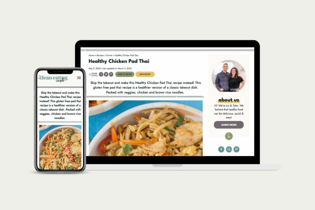
When we worked with Liz at The Clean Eating Couple, we were able to add lots of fun little details to her blog post pages.
One of our favorite details is the fun line elements as dividers. Polka-dotted lines draw the eye to an important callout and borders around certain reusable blocks help to separate key content for the reader.
Another feature of Liz’s design is using custom icons in her headers as well as background colors to highlight certain content.
See Liz’s Healthy Chicken Pad Thai post to see these details in action.
True to your colors
Another way we like to work with blog post designs is by using color to guide the reader through the post.
Most blog post pages have a light or white background color, so a splash of color can grab the reader’s attention. For example, a colorful hyperlink grabs the reader’s attention and lets them know if they tap or click on the link, they’ll go to a new page.
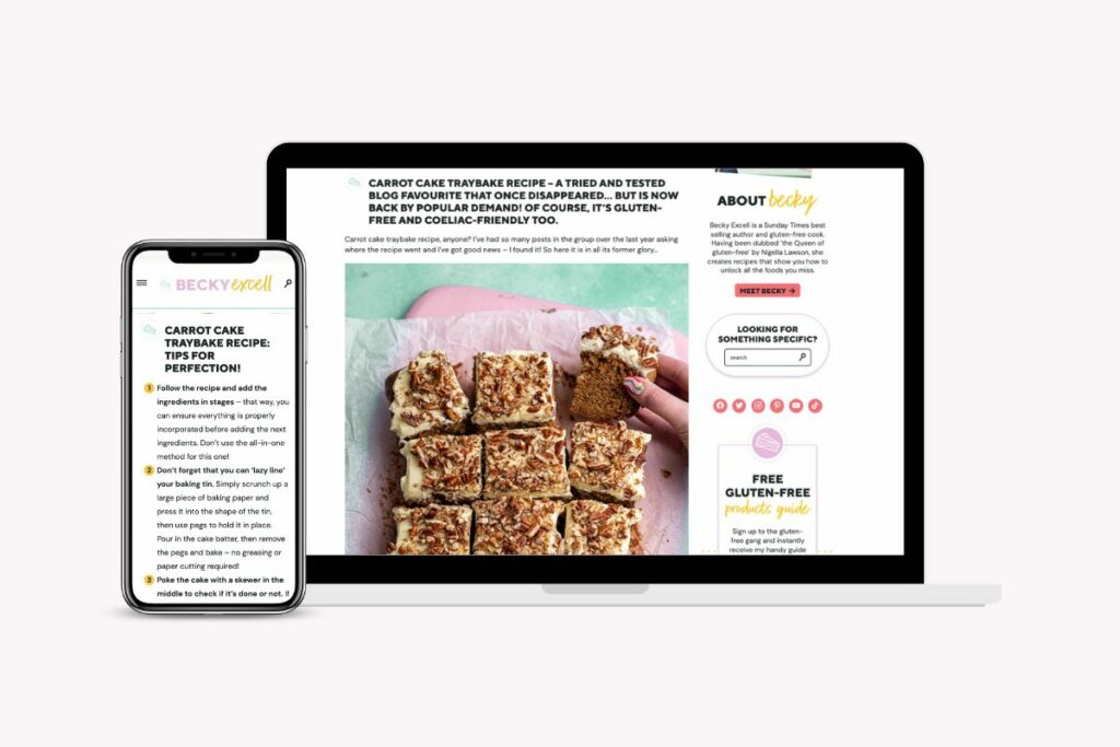
Becky Excell’s new branding we worked on was fun and exciting — in large part to the fun color palette we came up with. It was inspired by Becky’s bright, pastel, ice cream-like colors she uses in her food photography.
The design we did for Becky’s blog incorporates color in a lot of fun ways.
Bullet points and numbered lists are a great way to break up text, but colorful ones highlight key points even more, as well as drive home Becky’s branding through the addition of color.
The headings also incorporate a Becky’s brand mark, which is another way to sprinkle on-brand elements throughout the blog post. This helps the reader associate these marks with the brand, so they’ll recognize one of Becky’s recipes immediately as soon as they see that icon.
Becky’s site also includes another spot of color at the bottom of the page, where we added custom pagination to highlight more recipes and encourage the reader to click around the site some more.
See Becky’s colorful site in action on her Carrot Cake Traybake recipe.
If you’re customizing your theme yourself, here’s a little tip: One of our favorite ways to access brand colors is to use ColorPeek. It’s a handy website you can bookmark with your brand colors at-the-ready to copy and paste.
Ready for action
Another thing that makes working with Grace & Vine different is the way we focus not just on what we want the reader to do right now, but we also put a heavy consideration into what we want them to do next.
If you’re not thinking about the actions you want a reader to take, you’re missing out on potential email sign-ups, shares of your recipe, new social followers, ratings, comments and even sales.
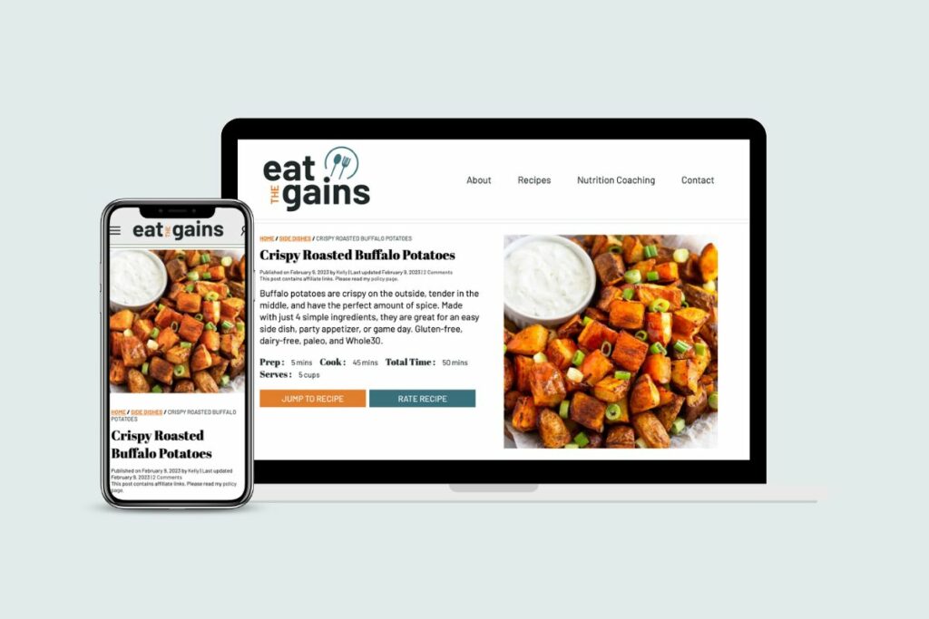
When we worked with Kelly from Eat the Gains, we added a lot of elements to encourage extra actions.
At the top of Kelly’s blog post pages, we added an “At a Glance” section, which is a feature of the recipe card plugin she uses, WP Recipe Maker. This not only gives the reader a quick look at key features of the recipe, but also an option to jump straight to it to give it a quick star rating.
Our team also added a custom email sign-up box that featured Kelly’s freebie ebook. When a strategically-placed subscription form stands out, it’s more likely to get sign-ups.
Of course, a form in the blog post is just one way to market your freebie and you should consider doing more in this area. And if you don’t have a freebie yet, that’s something our team can certainly help with when we tackle your redesign, too.
Kelly’s sidebar was another focus, as she had quite a bit of desktop users visiting her site. We made sure it was filled with easy-to-access content, links to her social accounts and an eye-catching search bar to encourage readers to poke around further.
Head to Kelly’s Buffalo Roasted Potatoes recipe to see these items in action.
While lots of these elements can be added to an out-of-the-box WordPress theme, a custom site design allows much more flexibility to make these kinds of thing happen, and we’d love to work with you.
ready to take your food blog to the next level?
We work with food bloggers looking to stand out of the crowd through custom brand and website design.


Leave a Comment