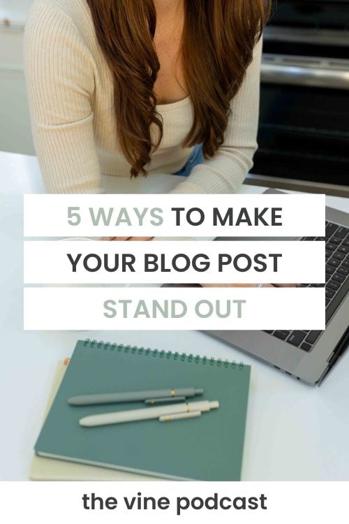
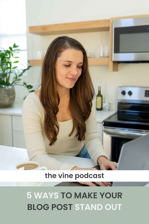
Your blog post is the bread and butter of your food blog. It’s what readers are searching for and the type of page that gets the most traffic. But in a very crowded sea of Google search results, how can you make sure your blog post stands out when someone visits it for the first or even tenth time? In today’s episode I’m sharing 5 ways you can make your blog post stand out to hopefully leave an impression with your new or loyal readers.
We have covered a lot of the major pages on most food blogs, but I realized we have only skimmed the surface of covering your blog post itself. When working with our design clients we refer to this as the “single post” but whatever you want to call it, the blog post is arguably THE most important page or template on your food blog. It is what readers are coming for and what is on that page will ultimately decide whether someone jumps back to their search or sticks around.
Styled Gutenberg Blocks
Y’all knew I would start with this, right? 🙂
If you do nothing else I talk about in this episode, start doing this right away. Gutenberg blocks are designed to help content in your blog post stand out.
If you have regular repeating sections, like a substitutions section, a “why we love this recipe” section, or recommendations for other recipes to try, start using Gutenberg blocks to design these sections.
This will help readers get to know your content structure and LOOK for these tips when they come back to new posts. One of our clients talks about looking for her green substitutions box all the time on her stories to train her readers to find it.
Reusable blocks like these will save you time AND help your readers. As a reminder, you can check out the Simplify With Gutenberg course to learn more about using Gutenberg to create your blog post template.
Recipe at a Glance
Let your readers know what to expect from your recipe. This will help them to take a breath before using your jump to recipe button, but will also help prepare them for if the recipe is a good fit for them.
The introduction paragraph of your blog post can serve as a “recipe at a glance” but there are also a lot of ways to do this from a design perspective.
For a lot of our clients, we end up designing a special call out section at the beginning of their blog posts to showcase the information someone needs to know “at a glance” – like the total time a recipe takes.
If you’re using WP Recipe Maker, this is a great built in feature that you can utilize. If not, make sure that prominent information is in your introduction paragraph to HELP your readers.
Design Your Recipe Card to Stand Out
If your recipe card blends into the rest of your content, this is a MUST. Your recipe card should look different than the rest of your blog post so that readers know when they have found it. Not every user utilized the Jump to Recipe button and even if they do, they may scroll back through your content and need to find the recipe card again.
Make sure your recipe card has a different color background, a border, or some other way to signify that it’s the recipe card.
Give Readers a Clear Call to Action
This can be a tricky one because to be honest, we want our readers to do 10 things after they view the recipe card.
But I want you to REALLY get strategic here.
What do you really want your readers to do? Is it to subscribe to your email list? Is it to view your recipe index for more recipes? Or is it to leave a comment and rating?
Being intentional about this choice will make it much easier for you highlight this next step and get your readers to take action!
Use Pop Ups/Sign Up Forms Strategically
- Make sure the pop up is delayed
- Be sure the sign up form showing is relevant to your post itself. For example, not showing a smoothie freebie on a grilling post.
- Put this in a good spot for readers to see it while they are close to your recipe card.
Pin for later
Come browse my Pinterest for more inspiration >>
topics
Browse through some of the topics we discuss on the blog, then click over to see all the posts within that topic!
hey friend, i’m madison
Food blogger turned web designer
I’ve been where you are. Growing fast, feeling overwhelmed by the tech side of things, and realizing that somewhere between hitting 100k sessions and launching that new revenue stream, the foundations of your business got left behind.
I started out as a food blogger, so I get it. The constant juggling. The feeling that your site doesn’t match who you’ve become. The frustration of working way too hard while your brand and tech hold you back.
That’s why I created Grace + Vine Studios—to help monetized food bloggers like you finally catch up. Whether it’s your branding, your website, or just figuring out what the heck comes next, I’m here to help you build a business that reflects where you are now and actually improves your life instead of consuming it.
