
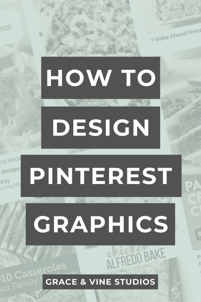
Creating stunning Pinterest graphics for your blog doesn’t have to be difficult! Find out how to design Pinterest graphics for your blog including what you should and shouldn’t do for fonts, colors and which images to choose.
Can’t listen to the episode? Read on for the transcript!
It seems like the rules are always changing for Pinterest but there’s one thing that is consistent, you need Pinterest graphics!
So today I’m diving into my tips on designing Pinterest graphics and what you need to consider.
General Layout and Size for Pinterest Graphics
What size should Pinterest graphics be?
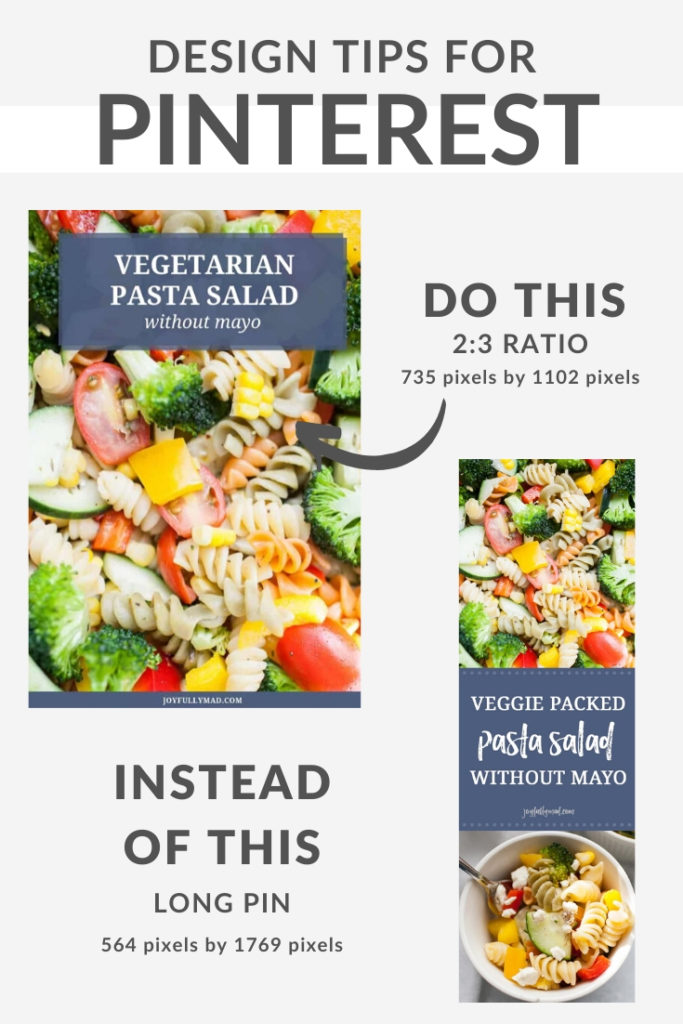
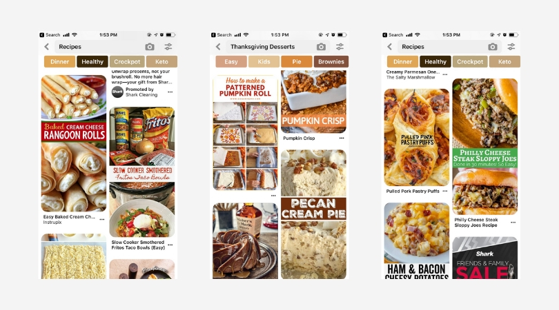
You want to design pins that are a 2:3 ratio in size. This could be a few different sizes:
- 600 x 900 pixels
- 1000 x 1500 pixels
- 1200 by 1800 pixels
Should you use long pins?
The way that the Pinterest algorithm works will cut off any images that are at a different ratio than 2:3. So long pins, or they’re sometimes referred to as giraffe pins, are generally going to get cut off in the feed, if they are not performing really, really well.
Make sure that when you’re designing Pinterest graphics that you are using their ratio that they have recommended.
How to Choose Images for Your Pinterest Graphics
What types of images should you look for?
The image you choose for Pinterest is extremely important! This is the first impression for your blog post and you want to make the image in your Pinterest graphic highlight your recipe!
Also consider that a lot of people are using Pinterest on mobile devices. That means your image should take up most of the pin size and show the focal points of the recipe.
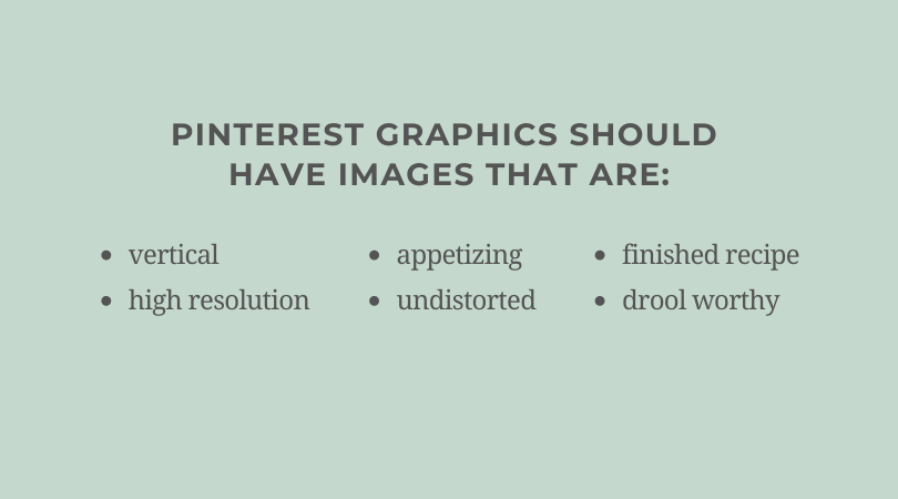
You want to look for images that are:
- Vertical
- High resolution (not blurry or fuzzy when used in a pin)
- Appetizing: this image should showcase how delicious the recipe is!
- Doesn’t stretch or distort when used in a pin
- Typically a finished image of the recipe
- Drool worthy!
So if for example, your recipe is for a chocolate mousse pie, maybe it is the image that shows the fluffiness of the moose in the pie, or maybe it’s the image where you’ve taken a bite out of the front of the pie so you can really see the texture that is in the filling.
Images like that are really going to perform well on Pinterest because it gives people literally a taste of what that recipe might be like.
Make sure to place the focal point of your image in the center of the graphic.
Text on Pinterest Graphics
Your text on the pin doesn’t have to be your blog post title.
It can be a variation of your blog post title or it can be something totally different.
Sometimes on Pinterest it makes sense to use a different title or a more descriptive title with more adjectives or keywords kind of thrown in there.
The amount of text that is on your Pinterest graphic should be minimal.
When designing a pin, look at it at 25% to see what it might look like on mobile.
Use text to highlight features of the recipe that someone would be searching for, like diet or cook time.
For example, if you are sharing a recipe that is gluten free or paleo, maybe you want to include a little bit of that text underneath the blog post title that is on your graphic. This also works for things like “30 minute meal” or “quick lunch”.
Use this sparingly because people are going to see it much smaller, but really everything that you’re putting on your Pinterest graphic should add value to that recipe.
Consider the intention of someone when they come to your blog from Pinterest. I’ve talked about this in previous episodes, but it’s super important when designing graphics.
If you know that your recipe is a 30-minute meal and someone is going to click from a Pinterest image into your blog and the first thing that they’re going to do is go to see how long this recipe is going to take, then include that information on your Pinterest graphic when you can.
If you can’t include it in the graphic, then definitely make sure it is in the description.
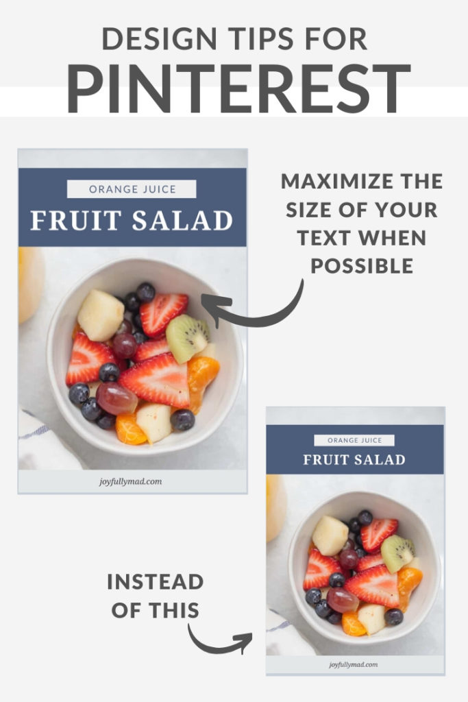
Make sure to use large text
The text on your graphic should fill out the space. I like to put one word per line so that the text is as large as possible. Especially when the blog post title is 3-5 words, it’s easy to make the text large and fill out the width of the pin.
Tips for Fonts for Pinterest Graphics
Use simple, legible fonts. Especially when viewed much smaller, the fonts should be simple.
Avoid using script on Pinterest unless it is an easy to read script that you are using for one word only.
You can use your brands fonts on pins if the fonts are easy to read when small.
Use a balance of sans serif and serif fonts to make the graphic interesting.
Pro tip: adjust the letter spacing in between the letters to make it easier to read on smaller screens. Just a tiny bit of space in between letters can really help it to be more legible, especially the smaller that it goes.
Colors for Pinterest Graphics
One of the biggest mistakes I used to see people making a lot on Pinterest is that they would have a Pinterest graphic that had a background color that was white.
If you’ve ever noticed when you’re scrolling through Pinterest, the background of the website of Pinterest is white. So when you have a white dominant pin, it’s going to be really hard for that pin to stand out.
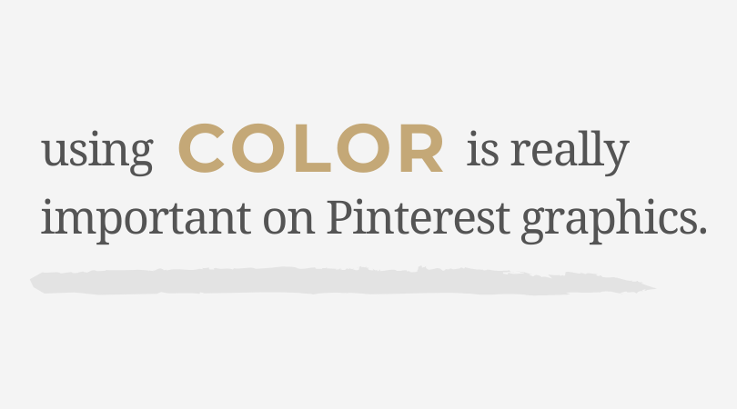
You can use your own brand colors if they work for your pins. If your brand colors will clash with the food then you may want to consider different colors.
Balance of Colors
If you have a background color for the text, don’t make the background color the same color as the food in the photo.
Choose a different background color and use the dominant food color as an accent color for the text.
If the colors aren’t balanced, it will make the whole image blend in and someone will scroll past it.
When you’re creating Pinterest templates, have different primary colors for each template.
How on brand should your Pinterest graphics be?
It really depends.
One thing that you definitely want to have is something that recognizes that it’s your pin, so it could be your logo if your logo is simple enough that it can be small, it can be your URL or it can be a submark or an icon that you use.
This is mostly just for people to be able to recognize your pins, but it also is really helpful so that people can’t steal your pins and use them for their own. So I definitely recommend having something that distinguishes that from your website.
Pinterest is really so saturated these days that it’s not as common to see pins, that when you’re scrolling, you immediately recognize the brand behind that pin.
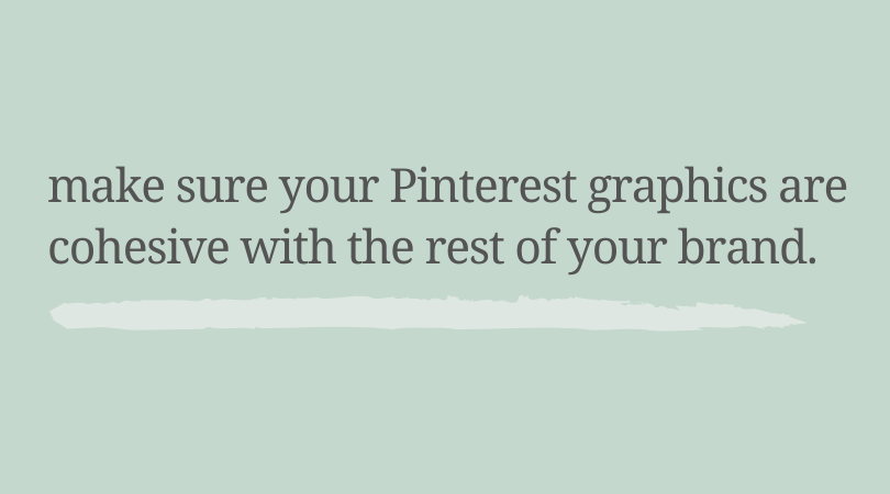
It’s important for you to be making sure that your Pinterest graphics are on brand for you and they don’t feel out of place for the rest of your brand.
Tips for Designing Pinterest Graphics
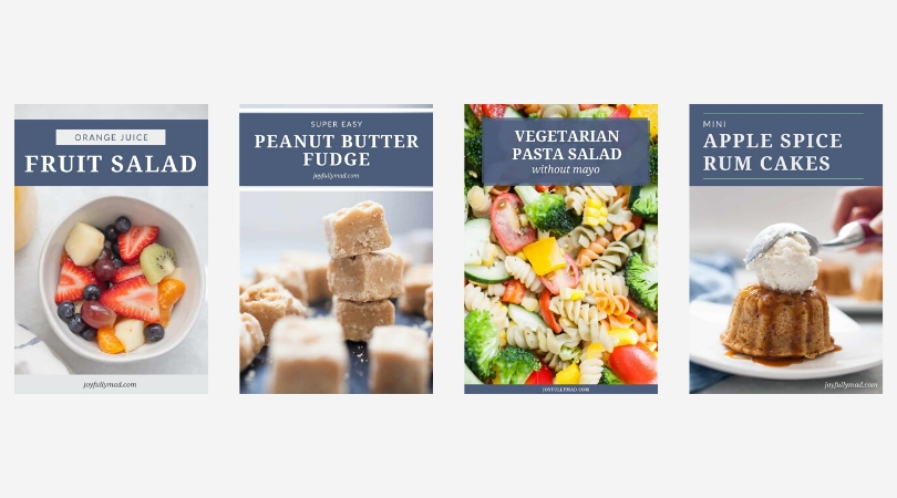
Use Templates
If you remember from episode 8 about simplifying your design work for your blog, I highly recommend having Pinterest graphic templates.
Have 3-5 Pinterest templates that you rotate.
This allows your content to go further, because you have multiple images for the same blog post. Pinterest considers each new image to be new content, so this helps you create less content but reach more people on Pinterest.
Test your graphics
See what works for your audience and for your content on Pinterest. Not everyone’s account is going to be exactly the same and that’s where Pinterest gets a little bit tricky.
When creating multiple pins, experiment with changing the title or the image to see which performs better.
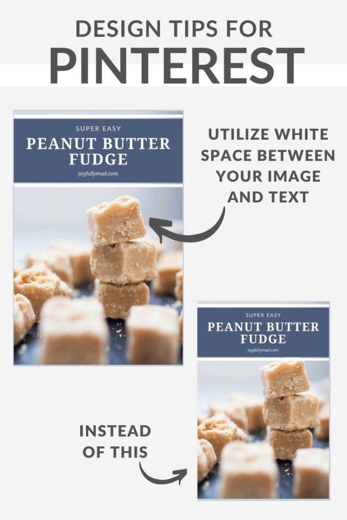
Consider white space in your graphics
By this I don’t mean having white in the graphic necessarily but white space means having breathing room around your text or image so that the whole graphic doesn’t feel cluttered.
If you have an image with a lot of white space on the top, then that’s where you can put your texts so that everything works well together.
If you don’t have like a background color where your texts is over that and you’re putting the text directly over the top of your image, make sure that there’s space between where the food stops and where the text begins.
Otherwise things are going to be cluttered and hard to read because there’s not enough space in between those two elements.
How many images should there be?
This is one of those situations where the answer is it depends and this is another situation where testing is really going to be important.
Create one template that has two images and then create another template that just has one and you can see which one does better.
It’s also going to depend on the recipe itself and the images that you have.
There are some images that are just those showstopper images where you know you don’t want anything else to distract from that. And there are other images where maybe it doesn’t showcase the entirety of what the recipe looks like.
Maybe it’s an overhead view versus a side view, and you really need both in order to get a good idea of what the recipe is, but make sure that when you’re adding extra images, you’re doing it because it’s adding value and it’s going to help people to know that this is the content that they want rather than just adding it just to do it.
I think it’s really important to have an example for both so that when you have a recipe where you need both, you already have that template designed.
Revisit your templates every six months or so and either redesign them, purchase new templates, or simply make sure that the templates you have are up to date with Pinterest standards.
Let’s chat

This was perfect! I have been struggling lately with my Pinterest images, as Madison and I had discussed via email, this episode was just what I needed. I loved the examples and I’m ready to change up my pin templates!
I am SO glad it was helpful for you! I can’t wait to see those new templates 🙂
Thank you!
The graphics on Pinterest are inspiring. I’m searching there for bloggers I keep checking out all the time. I think it’s important that your graphics have the same style (color and design use) and that makes your posts different from the others. This is a really obvious thing, but it is useful enough to make your blog recognizable.
I totally agree! I’ve heard from some people that their readers definitely recognize their pins in their feed. Which is an exciting realization!