
Today we’re continuing the conversation about all things branding. I’m shifting, specifically, into how to be consistent with your brand. With these tips you can take any branding you have, whether you did it yourself, paid $5 or $5,000 and use it consistently.
Can’t listen to the episode? Read on for the transcript!
I want to take a second to share a review from one of my listeners. This review comes from Liz from The Clean Eating Couple and it says:
I’ve worked with Madison for years and always look to her as a source of guidance for building my business. Her advice is so valuable and approachable, no gimmicks or tricks, just real tangible tips to help you take your brand and your business to the next level.
Thank you so much Liz for that sweet review.
I am just loving hearing the feedback from you guys on these episodes and seeing your reviews. If you haven’t had a chance to leave a review yet, I would love for you to go ahead and do that so that I can read yours on air too.
Next week I’ll be heading to the Mediavine conference in Austin, Texas, and I am so excited to just be digging into strategies for my blog, but to also see some of my favorite food bloggers there.
Honestly, I just love going to food blogger conferences to meet with people that I know super well, but also to meet new faces. I’ve gotten to connect with so many amazing food bloggers at different food blogging conferences.
If you’re going to be there, I would love to meet up, send me a DM on Instagram and let me know that you’ll be there. I would love to get to meet in person and chat.
Today we’re continuing the conversation from last week about all things branding. I’m shifting specifically into how to be consistent with your brand.
With these tips you can take any branding you have, whether you did it yourself, paid $5 or $5,000 and use it consistently.
One of the things that I hear from food bloggers all the time is that they struggle with using their branding consistently on different platforms.
This can happen whether you have done your logo yourself or you’ve paid thousands of dollars for it. It has nothing to do with the quality or the price of your logo.
Why is it hard to be consistent with your branding?
There are a few things that I’ve observed as to why it’s so hard to be consistent with your branding.
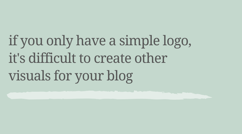
The very first reason is that you only have a logo.
Last week, in episode six, I talked about things that you need for your branding as a food blogger.
If you only have a logo, it’s really difficult to expand into things like Pinterest templates, a media kit, business cards, or even just be consistent with the look and feel of your Instagram feed.
Next is that you don’t know what to do with the files or the graphics that you’ve been given by your designer.
If you did work with a designer, maybe you have a bunch of files and you have no idea when you’re supposed to use them.
The next reason is that you can’t visualize your overall brand.
The last reason is that you’re reinventing the wheel every single time you’re creating something visual.
Why is it important for your branding to be consistent
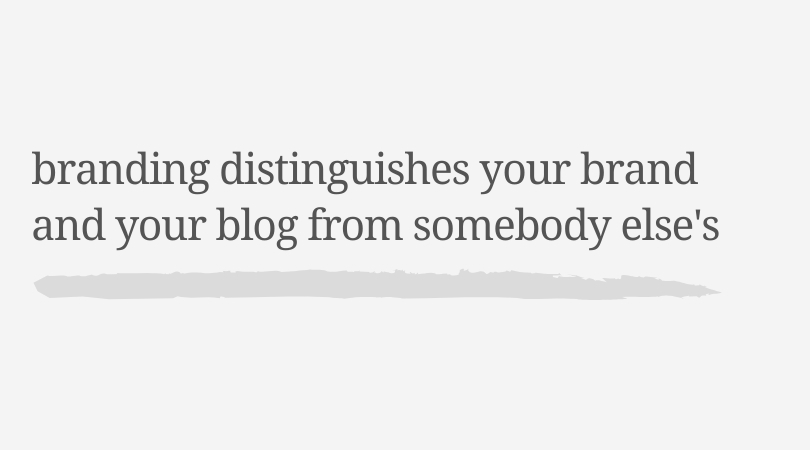
If you’re inconsistent, it’s going to take people longer to recognize your brand, or they might not ever recognize it if they feel like it’s always changing.
I’m talking about your visual branding specifically, but you can apply these concepts to your brand messaging or other parts of your branding as well.
You should be consistent because it saves you time and a headache when creating visuals for your blog.
Even as a designer, I do not start from scratch every time I’m creating something visual because that just takes away too much brain power. You need to work smarter and not harder when it comes to your branding, especially if this is not a strong suit of yours.
Why you’re struggling to keep your brand consistent
Let’s break down these reasons that it can be difficult to be consistent with your branding.
1. You only have a logo
When I was starting this podcast, I needed to come up with a logo it. I had a logo for my web design business, Grace and Vine Studios, and I had colors.
I didn’t want to make the logo for The Vine Podcast, something totally different with different colors and different fonts. I really wanted to have it be recognizable as an extension of my original brand, but I needed to expand my branding beyond what I had.
The font in my Grace and Vine Studios logo is handwritten and not by me, so I often struggle to find things that are complimentary for that script.
I decided to pick something that would be more versatile and that I could use across different channels.
For The Vine Podcast, I chose a new script font to pair with the current headings and body fonts that I use to create different graphics. I also designed two patterns that I could use interchangeably on social media graphics.
Just adding those few things, I created a completely separate sub-brand, but it helps me to stay consistent with my branding.
When I’m talking about the podcast, you can do this exact same thing for your food blog, whether you have a logo or not.
This is something that you can do.
Make sure that you have these few things picked out:
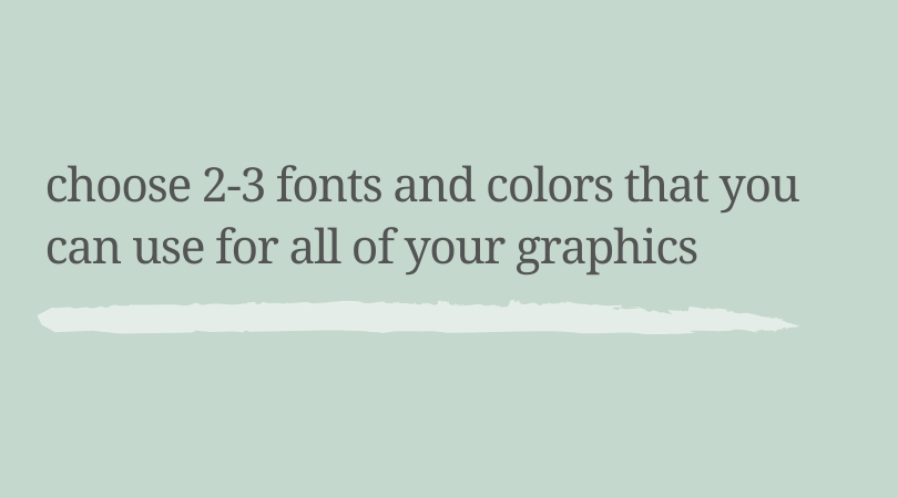
Fonts
You want to have 2-3 fonts that you use on any graphic that you’re creating for social media, Pinterest, your media kit, et cetera.
You want to have no more than three fonts that you’re referencing.
Colors
Then you also want to have two to three colors, but you can have a little more fun with this.
As you become more comfortable, you can add in complimentary colors. However it’s really helpful to stick to two to three that you can be consistent with and have people start to recognize.
Do you have other files like different logo types or patterns or icons? You want to grab those, too, so we can put them all together in a few minutes.
2. You aren’t sure what to do with the files you have
For some people, they have different design files that they were given by their designer, but they’re really not sure what to do with them.
The files sit in a folder on Dropbox or on Google Drive, and they just don’t even look at them because they’re overwhelmed with what they have.
Here’s a pro tip for you:
When you’re working with a designer, ask them what to do with the files that they give you before your time working with them is over.
For most designers, you can always reach back out to them and say, “Hey, I noticed that I have this file and I’m not really sure when I should use it. Can you help me?”
A really good brand designer, even a mediocre brand designer, is definitely going to be willing to help you use your files because they designed them for you and they want these different files to be used in your branding.
So here’s a few files that you might have and you might need:
Your primary logo
This is your main logo, the header that’s on your website. Your primary logo is really the visual element that’s going to be used the most to help people recognize your brand.
Your secondary logo
You may also have a secondary logo. This is going to be a simplified or different shaped version of your logo. Especially if your primary logo is complex, it’s beneficial to have a secondary logo that you can use as an alternative.
Textures, patterns, or icons
For some cases you might have things like textures or patterns or maybe even custom icons designed for you. Not every brand is going to have this; not every designer is going to design these. If you have them, you want to just have them ready and know which ones you have and what they can be used for.
Different File Types
Let’s talk about different file types really quickly. I just want to touch on what these are so that you know and you can know when you should use them.
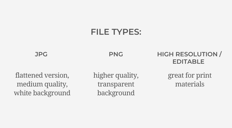
JPEG
The first type is a JPEG. Most people are familiar with this. It’s going to be a flattened version, probably medium quality, and it’s going to have a white background.
PNG
The second file type is a PNG, and this is going to have usually a transparent background. This is sometimes a little bit higher quality than a JPEG just because it’s not as compressed.
High resolution / editable file
Lastly, you might have some sort of high resolution or editable file. This could be an Adobe Illustrator file, which is a dot. AI or it could be a PDF. Not all designers are going to provide this.
I wanted to mention it in case it’s a file that you have because these types of files are really good for print materials. If you need to scale the logo to a larger size for any reason, you’ll also use this format.
If you have a folder from your designer that has these files and you are noticing some files that you don’t need or don’t want to use, don’t be afraid to move these to a separate place so that you’re not overwhelmed looking at what you have.
You can even change the file names if it will help you remember.
When I work with a branding client, I have a folder that I send them with sub folders in it to describe exactly what the different file types are and why I’m giving them to them.
Sometimes I will even record a video walking through that folder with them so they know exactly what they have.
It is a huge pet peeve of mine when people feel like they can’t use what they have and what they paid really good money for.
It’s really important to me that my clients are set up for success and that they know which files they have and when to use them.
3. You can’t visualize your brand
Maybe for you have a logo, maybe you have those extra files, but you don’t know how they all work together.
A brand board is something that really anyone can put together. You do not have to have a design background in order to put this together.
It shows you at a glance what your brand looks like and the different elements of your brand.
This can be an invaluable reference to your brand and making sure that you can stay consistent.
A brand board can have as little or as much as you want it to have. It gives you a place to reference when you’re making graphics for your blog or designing things like an ebook or a media kit.
You can design this in Canva or in any program that you are comfortable with.
You want to save this as a PDF and keep it on your computer, or you can even send a JPEG version of it to your phone to reference.
Grab the exact template you see above and start creating a more consistent brand today.
Shop Now
4. You’re reinventing the wheel every single time
Now that you have everything laid out for what your brand is going to look like, it’s time to be consistent.
You’re going to stick to the fonts and colors and patterns that you’ve chosen.
The best part about this is that it eliminates decision fatigue.
Even as a designer, it can be totally paralyzing to me to have hundreds of font options or tons of colors to choose from.
Whether I’m working with a client on branding and web design or I’m designing something like an ebook, I try to visualize the brand and refer to a brand board if they have one.
If I’m working with a client that doesn’t have a brand board already, sometimes I will just put those color swatches and fonts to the side just so I can look at a glance and get an idea of what I need to do to make sure that I’m consistent.
If design is not your strong suit, reinventing the wheel is going to cost you hours of time and probably a lot of frustration.
Having that brand board in place is going to be the first step in making sure that you can be consistent.
It’s going to keep you from reinventing the wheel every single time.
Pinterest Graphics
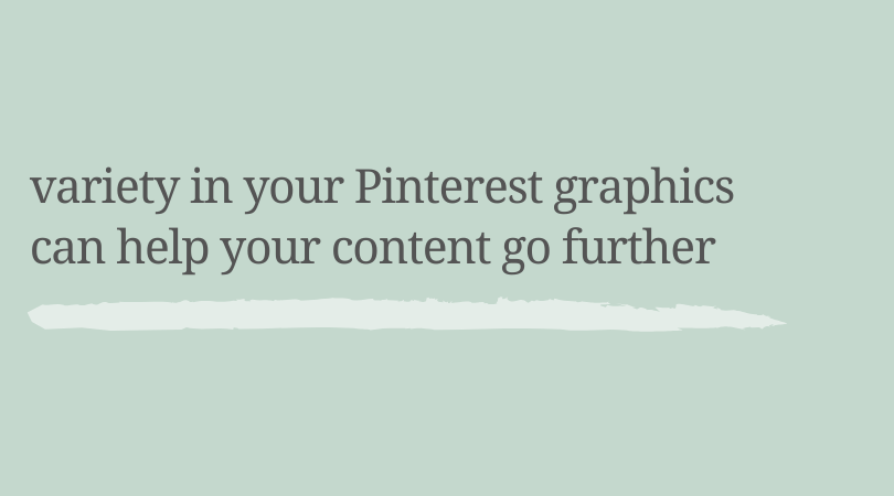
I want to make a note about Pinterest graphics because these can be a little bit different.
Creating different styles of your Pinterest graphics can be really helpful to make sure that your graphics aren’t getting stale.
I have a couple of clients that I work with on a monthly basis who every quarter or every year have me design new Pinterest templates for them.
This is super helpful, especially if your blog gets a lot of traffic from Pinterest, to make sure that you’re putting out new graphics so people don’t just start to kind of ignore your graphics because they’re so used to them.
That’s an important note to make, but you can still make sure that you’re being really consistent with this. You can even kind of do a sub brand for your Pinterest templates every time that you want to create new ones if you’re doing them on your own.
How to keep your branding consistent
In order to keep your branding consistent, you’re going to start with a brand board.
This brand board is going to show you the colors, your fonts, your patterns, your textures, any icons that you use in your branding at a glance.
Essentially, it’s going to include anything that needs to be taken into consideration before you open Canva and design something new for your blog.
It can be super messy, it can be thrown together or it can be super polished, whichever is going to help you.
You want to reference this brand board every single time you’re designing anything for your blog – a Pinterest template, a media kit, a business card, anything.
You can even have this open when you’re doing things on social media as well.
Maybe while you’re taking pictures of your recipes, you can have your brand board right in front of you so you understand the overall feel and look of your brand before you start taking photos.
Adding to your brand board
This might be if you feel like there’s something missing or you’re struggling with creating a certain kind of graphic because there’s a lack of a font choice or a color choice.
That’s when you can add something new to your branding.
If you feel like your images on social media are kind of stale and flat, maybe you want to add in a texture to that.
However you only want to do this when you feel super confident about what you’re adding. Don’t add something to your brand board because you feel like you have to do it because you see somebody else doing it.
Saving your working files as templates
If you are creating a Pinterest graphic in Photoshop for example, even though you might know what it looks like, don’t spend extra time creating a new one every single time.
Save it as a PSD file and make sure that you open it and work from that.
Every single one of my clients that I work with on a retainer basis, whether I’m creating YouTube thumbnails for them, Pinterest graphics, or something else for their brand, I’m making sure that I have a working file to reference and start from next time.
How to be consistent on Instagram
I want to shift into something a little bit different as it pertains to branding and that’s how to be consistent on Instagram.
This is another struggle that I hear from food bloggers a lot – specifically from my clients that struggle with being consistent with their branding on Instagram.
This is a little bit different because as food bloggers, you’re not necessarily sharing a lot of graphics on Instagram. You’re probably sharing more photos of your food and your recipes, so being consistent with that can be a little bit tricky.
There’s a couple of different ways that you can tackle this.
Reference your brand board
The first is, again, to reference that brand board and to see what the overall look and feel and colors of your brand are. Then carry those over into your photos and into your Instagram feed.
Create an ideal grid
The other thing that you can do is set an ideal grid for your feed.
For me it looks a little bit different because I’m using graphics within my Instagram feed.
For you maybe it’s that you vary the angle of your photos and which photos you’re using in your feed.
Try not to do the same exact angle of photography every time.
Maybe it’s a specific type of ingredient that you feature. Maybe you have some process shots that you feature.
There are lot of different ways that you can do this. I’ve found in my experience when I just pick a layout that I want to follow, it’s so much easier for me to schedule out my content on Instagram because I know what I’m looking for when I go to find a picture to publish.
Instagram Stories
The other place that you might struggle with being consistent is on Instagram stories.
There are so many different things that you can do on Instagram stories, and I’m not going to go into all of the different marketing techniques of those.
Even if you just plan out the general topics of conversation that you’d want to have on Instagram on different days or when you want to share maybe a process shot or a behind the scenes video.
Doing those things and planning them out can make a world of difference with planning content and posting consistently.
One thing that is really helpful to decide when it comes to Instagram and Instagram stories is how often you’re going to use things like graphics.
If you are always going to share just photos, then decide that.
Yes, you can vary it and include a graphic here and there, but at least then you won’t feel like you have to create graphics all the time. You’ll know your feed and your Instagram stories are mostly going to be just your photography and that’s okay.
On the other hand, if you know you want to use graphics, maybe you need to simplify the process by investing in some Instagram story templates or Instagram feed templates.
I actually have a template shop that I’m going to link to in the show notes that has some Instagram story templates to give you some ideas or that you can go ahead and purchase if you are looking for Instagram story templates.
Using templates can help you to maintain consistency on Instagram stories and help you avoid reinventing the wheel every single time that you want to share about a recipe on Instagram.
Wrapping Up
As we wrap up today, I want to remind you that being consistent with your branding has nothing to do with whether or not you have a logo, how much you paid for your logo, or if you did it yourself.
Being consistent with your branding really comes down to whether or not you have an understanding of what branding is and what it looks like.
Reinventing the wheel every time is just not knowing what you already have and feeling like you need to start from scratch with different things like fonts or colors.
Having a brand board is invaluable, and the faster that you can create that and have that as a reference point, the faster you’re going to be consistent when it comes to your branding.
Being consistent with your branding is going to help people start to recognize your brand and to trust it.
This matters whether you have two people following your blog or 200,000. It really doesn’t matter how many people there are.
It matters that you’re consistent and that people can start to know what to expect because honestly there are so many bloggers.
There’s so many content creators out there that people are starting to become slightly jaded when it comes to content marketing.
The faster that you can have people trust you, recognize your brand, and know that they can come to you to meet the needs that they have is going to make a world of difference. That’s really why consistent branding is so important.
I hope that this episode will teach you that you don’t have to start from scratch.
You can take the brand that you already have and you can make it work for you. You can make it work harder for you so that you can be smarter about the time you’re spending on your blog.
One of the things I see in the food blogging world, especially as a brand designer, is that there’s a lot of people that feel like they need to rebrand every year or that they need to reinvent the wheel with their visuals.
What you really need to do is just get a view of what you already have and understand how it can work for you.
The problem is not necessarily that you don’t have a brand, it’s that you don’t know how to use it.
I hope these last two episodes have really helped you to figure out what your branding is, how you can be consistent with it, and how you can use it.
There is certainly a season and a time where it makes sense to invest in new branding for your blog.
I would love to chat with you about that if that’s something that you’re considering right now to help you to figure out whether it’s the right time for you or not, but don’t feel like you have to reinvent the wheel all the time.
You really can use what you have, whether it’s good, bad or indifferent, and you can just make it work for you.
The best case scenario is to be consistent.
Next week’s episode will be our last episode in this series on branding, and it will be all about how to simplify your branding and simplify the design work on your blog.
I know design work can be a huge hassle and a headache for a lot of food bloggers since it’s not your zone of genius and it’s not where you want to spend your time.
I hope that these tips will help you work smarter in the design aspect of your blog and help you to buy back some time so that you can be focusing more on spending the time creating content for your audience.
I know as a food blogger, that’s ultimately the thing that you love the most.
topics
Browse through some of the topics we discuss on the blog, then click over to see all the posts within that topic!
hey friend, i’m madison
Food blogger turned web designer
I’ve been where you are. Growing fast, feeling overwhelmed by the tech side of things, and realizing that somewhere between hitting 100k sessions and launching that new revenue stream, the foundations of your business got left behind.
I started out as a food blogger, so I get it. The constant juggling. The feeling that your site doesn’t match who you’ve become. The frustration of working way too hard while your brand and tech hold you back.
That’s why I created Grace + Vine Studios—to help monetized food bloggers like you finally catch up. Whether it’s your branding, your website, or just figuring out what the heck comes next, I’m here to help you build a business that reflects where you are now and actually improves your life instead of consuming it.
